SCENIC DESIGN
AutoCAD File (3 plates)
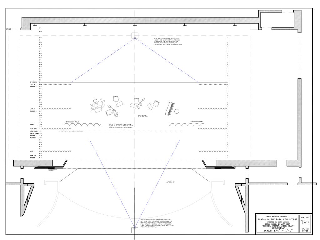
PDF File: Plate 1, Groundplan
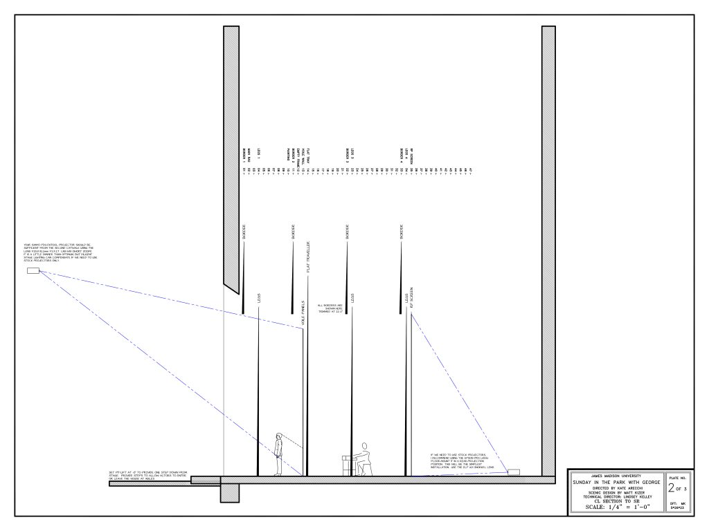
PDF File: Plate 2, CL Section
PDF File: Plate 3, Elevations
PDF File: Prop and Paint Discussion
The design includes versatile elements that can combine and work together. The show includes many moments in which space and storytelling are abstract.
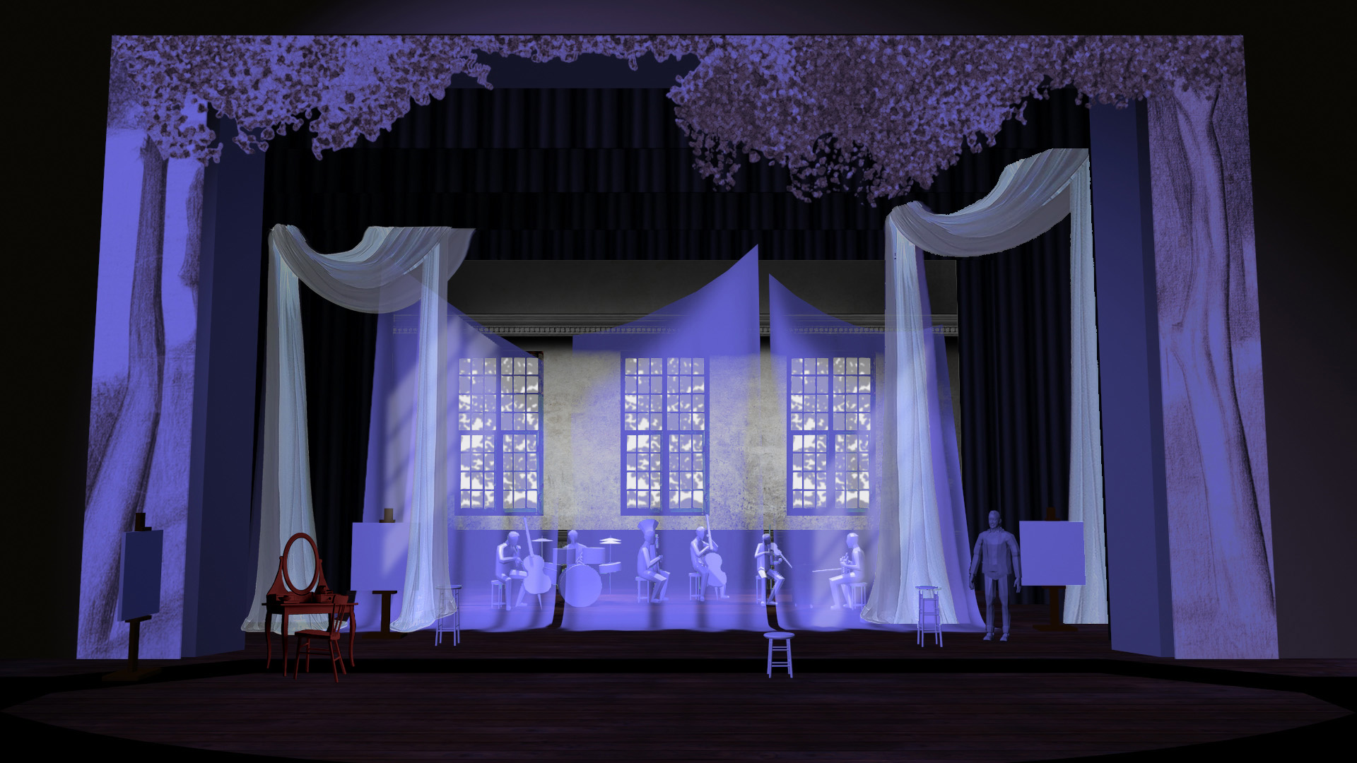
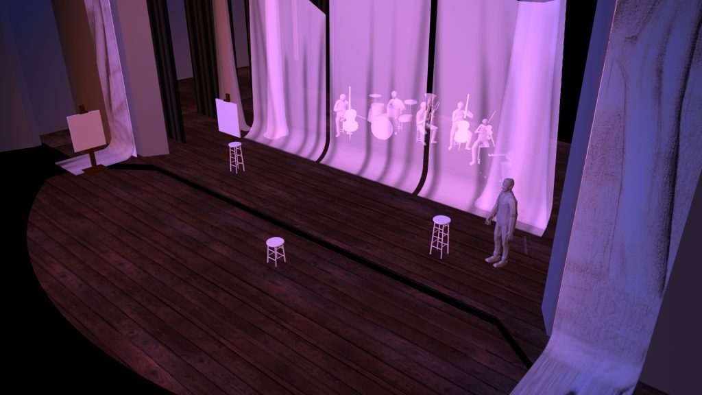
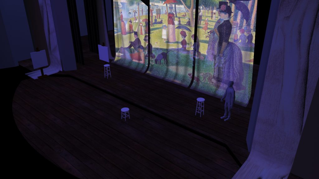
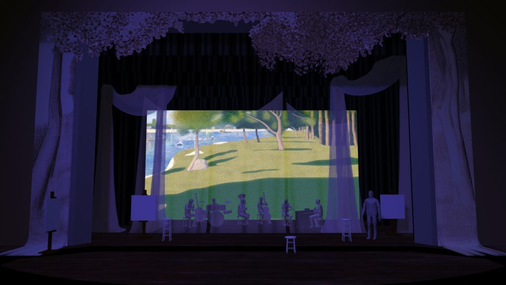
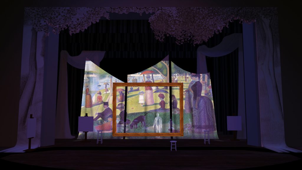
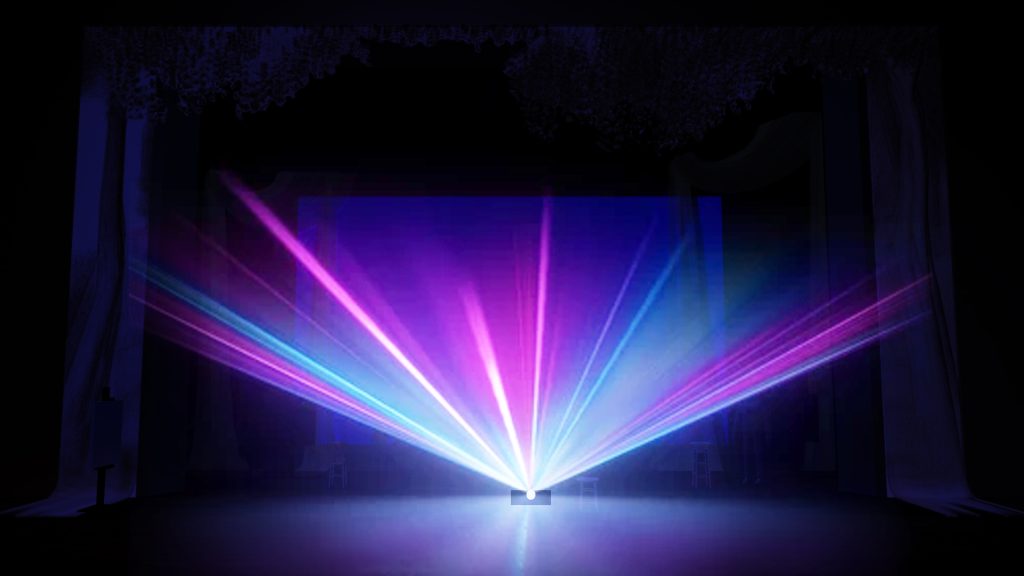
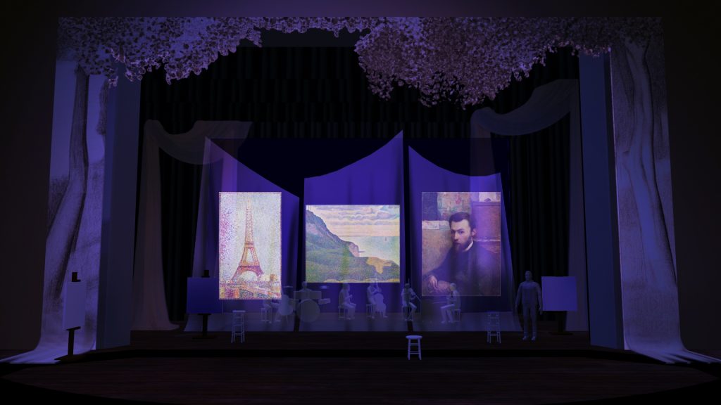
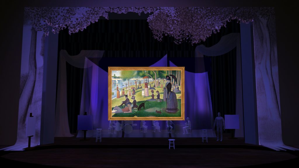
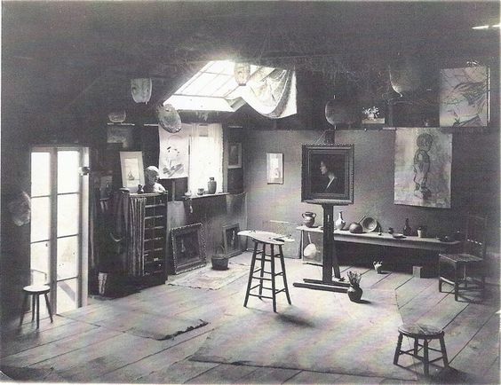
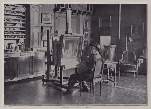
The base setting for the show is an expressionistic version of Seurat’s studio. It includes stools and canvases on easels. The proscenium is framed with what looks like enlarged versions of studies Seurat created in pencil and charcoal. White translucent fabric (voile) is draped and swagged in the space. It is used in the show for scrim effects and as a projection surface. The orchestra is center-stage, upstage of the studio elements. Behind the musicians is a full-stage rear-projection screen. All of these elements are combined scene-by-scene in varying ways to tell the story and create stylized theatrical space.
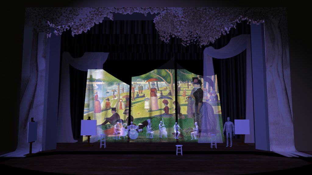
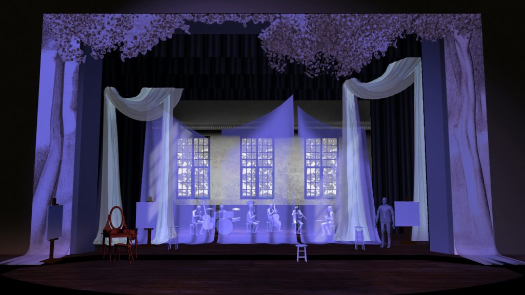
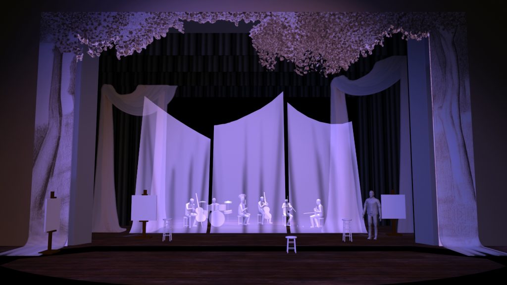

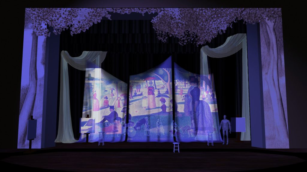

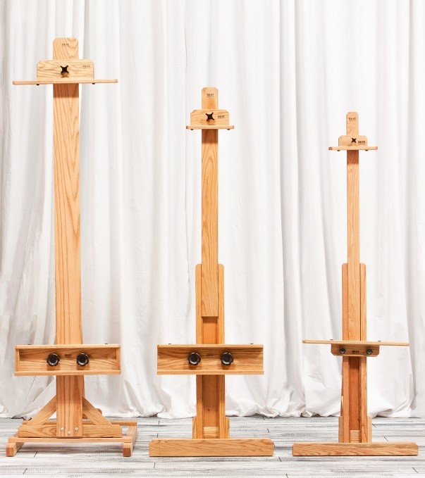
EASELS
Please use chimayo easels, or simply build imitations of them. They do not need to be adjustable. These could be built in the shop if necessary. They have a small footprint on the deck and are easier for actors to navigate around. Aged wood, dark wood, or black are preferred. Build or provide three total, each with a canvas. The canvases are blank and white. Build these as simple soft flats covered with starched muslin. 36”h x 32”w.

STOOLS
Please provide a small assortment of wooden stool. Two 30” stools and two 18” stools might be ideal, though Kate is likely to develop preferences in blocking. 24” stools might serve. White paint that is worn, cracked, and chipped is ideal.
DOG AND MONKEY CUTOUTS
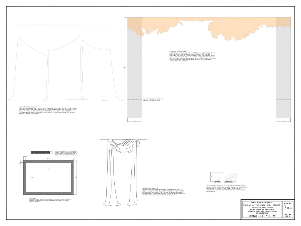
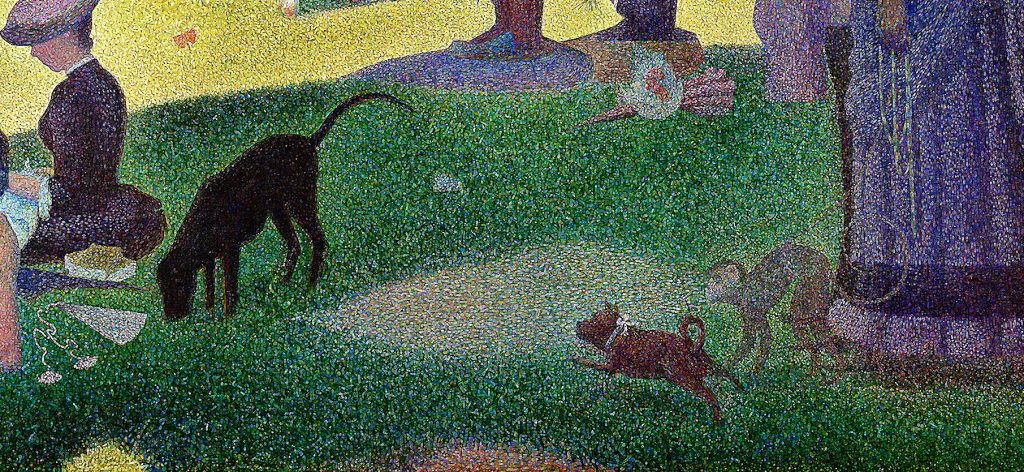
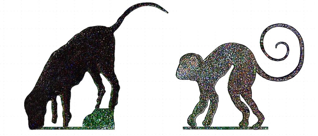
Please make ½” plywood or gatorboard cutouts of the black dog and the monkey from the painting. The dog’s tail should be 36” high. The monkey’s tail should be 30”. Outlines of these are included in the drafting.
FLOOR TREATMENT
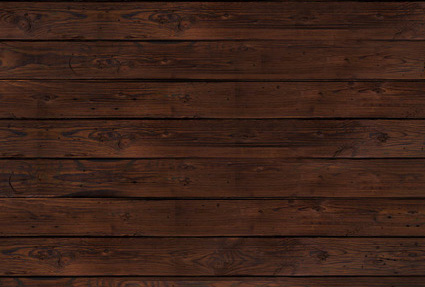
These boards are 12” wide. A wood-graining tool would be appropriate, probably used after wet-blending. The wood should be dark to minimize reflection onto the various projection surfaces. This treatment should continue up into the orchestra area to create a sense of unity of space.
CUT PORTAL
The cut portal has two legs and a header. The header might be more than one piece of material. The legs extend down across the apron about six feet. They should have a little bit of ripple or fullness as they cross the deck there. They are intended to echo the swagged voile elsewhere in the design and create a sense of mid-process.
Their paint-treatment is an imitation of Seurat’s studies and sketches towards the final painting. These are not intended to be projection surfaces. They are opaque. They do not move during the show.


