We don’t need to meet today. I’m going to try to make you all come online a little less. Below is some content I would like you to please interact with.
The Lighting Design Process
Normally we spend at least two classes in Hanaway and Studio experimenting with lights. I spend some time making this video for you to cover that same content. It’s only ten minutes long, but it covers a lot of concepts. You might want to watch it more than once. I will be referring to it as we move along on this section.
Choosing a color palette
Usually when I design lighting for a show, I choose a color palette based on hues. I try to keep my color choices within a specific set of colors. I might choose three colors to work with.
However, this does not mean that I am only choosing three color filters. I allow myself to vary the intensity and brightness of these colors within my choices.
Below is a hypothetical example. Imagine that I have chosen to use Magenta, Blue, and Amber for a given show. Those words are still pretty general.
I am likely to want to use different versions of these colors for different applications. Top-light and back-light tend to be much more saturated than front light in a show. Front-light needs to illuminate faces.
What I am very likely to do is to choose a set of colors similar to what you see below. Here I have gone through the swatch book (you can use the one I made for you online) . I have decided to have three different tiers of each color: A pale version, a medium version, and a deep version.
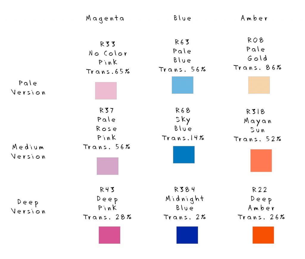
This will allow me to work within a finite color palette, but to assign appropriately deep or pale colors to each application. For a deep night scene, for example, I might love to have R384 as the top-light, but it would be much too dim for faces. R68 is a great choice for a night scene. It is dark, but still bright enough to see facial expressions. I could complement this with a little fill light in another color, or maybe even a gobo using R63.
I would like for each of you to choose three or four colors that you might include in your palette for Eleemosynary. Then, choose three tiers of intensity for each color, as I have done here.