|
What's this?
|
What's this?
|
| |
00 Clear
Used in color scrollers or cut-and-tape filter creations when a clear filter is needed. |
| |
01 Light Bastard Amber
Flattering for pale skin tones. Suggests strong sunlight. |
| |
02 Bastard Amber
Good where a tint of color is needed. Excellent for natural skin tones. |
| |
03 Dark Bastard Amber
Most saturated Bastard Amber. |
| |
303 Warm Peach
Heavier Amber-pink tint. Useful to create warm sunlight. |
| |
04 Medium Bastard Amber
Especially useful when cross lit with a cool color. Excellent for natural sunlight. |
| |
304 Pale Apricot
A peach amber. More yellow than 305. |
| |
05 Rose Tint
A clean pale pink; useful as a blush for some skin tones. |
| |
305 Rose Gold
A pale blush amber for skin tones and backlight. |
| |
06 No Color Straw
Slightly off white. Good for interiors. |
| |
07 Pale Yellow
Double saturation of 06. |
| |
08 Pale Gold
Warmer straw. Flattering to skin tones. |
| |
09 Pale Amber Gold
Deep straw. Good for late afternoon sunsets or firelight. |
| |
10 Medium Yellow
Yellow with green. Good for special effects. Unflattering in acting areas. |
| |
310 Daffodil
A soft medium yellow. Can be used for creating naturalistic effects such as early morning sunlight or for special effects. |
| |
11 Light Straw
Pale yellow with slight red content. Useful for candle effects. Can be used for area lighting. For bright day feeling. |
| |
12 Straw
Greener yellow than 10. Special effects and accents. Use with caution on skin tones. |
| |
312 Canary
Warmer than 10. A bright, vibrant yellow that evokes exotic sunlight. Use with caution on skin. |
| |
13 Straw Tint
Much less green than in other straws. Suggests warm sunlight glow when contrasted with ambers and blues. |
| |
313 Light Relief Yellow
Vibrant Yellow. More red than 312. Less green than all other yellows. |
| |
14 Medium Straw
Pale amber-higher red content than 12. Sunlight, accents, area lighting with caution to skin tones. |
| |
15 Deep Straw
Warm golden amber with some green. Useful for special effects-candlelight, firelight. |
| |
16 Light Amber
Excellent area light. Light pink-amber tint. Safe for most light skin tones. |
| |
316 Gallo Gold
A pale reddish gold, good for creating sunrise or sunset, or simulating incandescent light. A flattering naturalistic backlight color. Can be used for warm area lighting. |
| |
17 Light Flame
Heavier pink-amber tint. Useful for dance. Especially useful when balanced with a cool color. Good general warm tint in striplights. |
| |
317 Apricot
A rosy amber which produces a romantic sunset color. Useful as sidelight or backlight color. |
| |
18 Flame
Warm pinkish amber. Afternoon sunset. Good sidelight. |
| |
318 Mayan Sun
A medium salmon color which evokes feeling of a tropical island. A good sunset color. Interesting backlight and accent color. Good for warm tonal effects. |
| |
19 Fire
Strong red amber. Excellent for fire effects. |
| |
20 Medium Amber
Afternoon sunlight. Lamplight and candlelight. Tends to depress color pigment values. |
| |
21 Golden Amber
Useful for amber cyc light and late sunsets. |
| |
321 Soft Golden Amber
An amber with some green content. A good sunlight transition color that shows the progression of the sun from white or yellow to amber later in the day. |
| |
22 Deep Amber
Very useful as a backlight. Dramatic specials and firelight. |
| |
23 Orange
Provides a romantic sunlight through windows for evening effects. |
| |
24 Scarlet
Very deep amber. Red with a touch of blue. |
| |
324 Cherry Red
Vibrant orange-red. Helps red and orange scenery pop. |
| |
25 Orange Red
Good for firelight or special effects. Use when red with higher yellow content is needed. |
| |
26 Light Red
Vibrant red. Good alternative primary. |
| |
27 Medium Red
Good red primary for use with three-color light primary systems in cyclorama lighting, footlights, and border lights. |
| |
30 Light Salmon Pink
Excellent for general area washes. Gives overall warming effect to skin tones. |
| |
31 Salmon Pink
General wash. Good for follow spots. |
| |
331 Shell Pink
Warmer and lighter than 31. Good for fair skin tones and to emphasize romance. |
| |
32 Medium Salmon Pink
Deepest of the salmon pinks. |
| |
332 Cherry Rose
A tropical pink that is good for musicals or concert lighting. A good backlight color. Interesting accent color. Good for a splash of sunset color. |
| |
33 No Color Pink
A pale almost colorless pink. |
| |
333 Blush Pink
A pink tint that is excellent for most skin tones. A good color for warm area lighting. Lighter than 33. |
| |
34 Floral Pink
Useful for bright musicals. Creates a happy atmosphere. |
| |
35 Light Pink
Similar to 33, but slightly deeper. |
| |
36 Medium Pink
Good for general washes and cross lighting. |
| |
336 Billinton Pink
|
| |
37 Pale Rose Pink
Blue Pink, Use in general washes and toning. |
| |
38 Light Rose
Similar uses as 37, but with greater saturation. |
| |
39 Skelton Exotic Sangria
|
| |
339 Broadway Pink
A deep, saturated pink created for musicals and specials. Excellent for down and backlighting. |
| |
40 Light Salmon
Similar uses to 23 but a bluer color. Flattering for some darker skin tones. |
| |
41 Salmon
Light orange with high blue content. |
| |
42 Deep Salmon
More red than 342. |
| |
342 Rose Pink
Extremely intense, hot pink. Produces strong washes of color for concert and dance. Combined with a complimentary color like turquoise, will create a dynamic, sculptured effect. |
| |
43 Deep Pink
Rich, hot pink. Electric in effect with rich saturation. |
| |
343 Neon Pink
A bright, dark pink excellent for musicals or rock and roll concert lighting. A good color for creating fake neon effects with fluorescent tubes. |
| |
44 Middle Rose
Musical pink. Lush accents. Very versatile color. |
| |
344 Follies Pink
A vibrant, almost fluorescent pink with a cool component. Traditionally important as a special effects color in the Broadway musical. Follow spot and dance applications as a modeling color. |
| |
45 Rose
Use on scenery and background effects. Adds tone and modeling to scenery. |
| |
46 Magenta
Similar uses as 45 where more saturation is needed. |
| |
346 Tropical Magenta
|
| |
47 Light Rose Purple
Good for eerie or dramatic effects. Beautiful backlight color. |
| |
347 Belladonna Rose
Powerful magenta-purple. Good effects filter for dance. |
| |
48 Rose Purple
Pale evening color. Excellent for backlight. |
| |
348 Purple Jazz
A dusky purple. Good for simulating purple neon or old night club atmosphere. |
| |
49 Medium Purple
Darkest of the magenta purple range. |
| |
349 Fischer Fuchsia
A medium fuchsia good for special effects. An interesting backlight or accent color. |
| |
50 Mauve
Subdued sunset effect. Useful in backlights. To create seedy atmosphere. |
| |
51 Surprise Pink
Touch of color when white light is not desirable. |
| |
351 Lavender Mist
|
| |
52 Light Lavender
Excellent for general area or border light washes. It is a basic followspot color. |
| |
53 Pale Lavender
Use when a touch of color is needed. |
| |
353 Lilly Lavender
Same intensity as 55 with more red content. |
| |
54 Special Lavender
Same as 53, but warmer. Useful for beams of realistic moonlight. |
| |
355 Pale Violet
A cool lavender which acts as a neutral in a three color area lighting system. Will work well as a wash for drops or set pieces. Tones the space. Effective as moonlight shadows. |
| |
55 Lilac
Same as 53, but cooler. |
| |
56 Dark Amethyst
Highly saturated, good for side and backlighting and non-realistic effect. |
| |
356 Middle Lavender
A lavender halfway between 52 and 57 in hue and value. Useful for general illumination and side-lighting. |
| |
57 Lavender
Excellent backlight. Gives good visibility without destroying night illusions. |
| |
357 Royal Lavender
A rich lavender which will enhance blue and red costumes and scenic pieces. Excellent for nightime scenes. Rich, vivid accents, good in backgrounds. |
| |
58 Deep Lavender
Excellent back light. Enhances dimensionality. |
| |
358 Rose Indigo
A warm, red purple that recalls the Jazz Age. Useful for creating saturated color effects in live performance situations-club and musical group lighting. |
| |
59 Indigo
The original Congo Blue. A purple-blue, highly saturated, for modeling effects and non-realistic atmospheres. |
| |
359 Medium Violet
Midnight and moonlight illusions. Enforces mysterious mood. Useful for evening cyc wash. |
| |
60 No Color Blue
Helps maintain white light when dimmer is at low intensity. |
| |
360 Clearwater
The slightest blue tint. Excellent for eliminating amber shift when lights are running low on a dimmer. Good for cool area light. |
| |
61 Mist Blue
Excellent for general area washes. Very light cool tint of blue. |
| |
62 Booster Blue
Helps maintain white light when dimmer is at low intensity. |
| |
362 Tipton Blue
A soft clean blue. Good choice for cool area lighting. Can also be used to shift the amber of lamps running at low dimmer levels. |
| |
63 Pale Blue
Good for creating an overcast look and feeling. |
| |
363 Aquamarine
A pale blue-green color. Can be used for area lighting. A soft backlight color. |
| |
64 Light Steel Blue
Useful for beams of realistic moonlight. |
| |
364 Blue Bell
A clean light red blue. Creates naturalistic daylight fill color. Good cool area light. |
| |
65 Daylight Blue
Useful for achieving depressed moods and dull skies. |
| |
365 Tharon Delft Blue
Clean blue with more red than 364. A true color correction filter for film. Converts 3200°K to 5500°K. Good for area light. |
| |
66 Cool Blue
A pale green shade of blue; good for area or general washes. Creates an icy feeling on stage. |
| |
366 Jordan Blue
More green than 65. A crisp light blue-green. |
| |
67 Light Sky Blue
Excellent sky color. Useful for cyc and border lights. |
| |
367 Slate Blue
Clean medium blue. Good for sky color or moonlight. |
| |
68 Sky Blue
Excellent for early morning sky tones. Popular among designers for cyc and borders. |
| |
69 Brilliant Blue
Used for dramatic moonlight effects. |
| |
369 Tahitian Blue
Slightly more green than 69. |
| |
70 Nile Blue
Useful for very light midday skies. Occasionally used for general cool tint. |
| |
370 Italian Blue
Good to create eerie and mysterious effects. Good for night time water effects. |
| |
71 Sea Blue
Occasionally used for general cool tint and non-realistic washes. |
| |
371 Theatre Booster 1
Less red than 3202. |
| |
72 Azure Blue
A clean slightly green blue. Good moonlight fill. |
| |
372 Theatre Booster 2
Slightly lighter and less red than 3204. |
| |
73 Peacock Blue
Good for fantasy, moonlight and water effects. |
| |
373 Theatre Booster 3
Slightly lighter and less red than 3208. |
| |
74 Night Blue
Fantasy moonlight. Crisp and beautiful. Popular as a backlight or sidelight in contrast to area light. |
| |
374 Sea Green
For enhancing water scenes or deep sea environments. Greener than 73. |
| |
75 Twilight Blue NEW!
Less green & crisper than 76. |
| |
76 Light Green Blue
Distinctive greenish blues. Useful for romantic moonlight. |
| |
376 Bermuda Blue
A soothing green blue. More blue than 76. A good conventional moonlight color. Interesting tonal color. |
| |
77 Green Blue
Distinctive greenish blues. Useful for romantic moonlight. |
| |
377 Iris Purple
Medium neutral lavendar. Good wash light. |
| |
78 Trudy Blue
A rich clean red blue that warms to lavender when dimmed. |
| |
378 Alice Blue
A rich clean red blue that warms to lavender when dimmed. |
| |
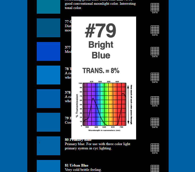
79 Bright Blue
Cool clear bright blue. |
| |
80 Primary Blue
Primary blue. For use with three color light primary system in cyc lighting. |
| |
81 Urban Blue
Very cold brittle feeling. |
| |
82 Surprise Blue
Deep rich blue with slight amount of red. |
| |
382 Congo Blue
Deep blue more saturated than 385. Good for dark night skies or for a backlight color. A great color for rock and roll concert lighting. |
| |
83 Medium Blue
Good for non-realistic night skies. |
| |
383 Sapphire Blue
A deep romantic blue on the red side. |
| |
84 Zephyr Blue
A true blue with excellent punch for bright skies. Lovely contrast to pale blues; adds coldness to shadows. |
| |
384 Midnight Blue
An intense red-blue. Deeper than 83 with a little more red. |
| |
85 Deep Blue
Deeply saturated blue with a hint of red. |
| |
385 Royal Blue
Excellent for non-realistic backgrounds. A very saturated blue. Pronounced red content that will shift toward purple when dimmed. Low transmission but will offer a striking contrast when used as a background with lighter accents. |
| |
86 Pea Green
Good for dense foliage and woodland effects. |
| |
386 Leaf Green
|
| |
87 Pale Yellow Green
Sunny spring mornings. |
| |
88 Light Green
Sunny spring mornings. |
| |
388 Gaslight Green
A yellow-green similar to the color emitted by gas lighting fixtures. Appropriate for period pieces i.e. La Boheme, and useful for creating reflections from fields and meadows. |
| |
89 Moss Green
Useful for mood, mystery and toning. |
| |
389 Chroma Green
Suggests reflected light from dense foliage. A brilliant cyc lighting color which will work for chroma-keying effects in television production. |
| |
90 Dark Yellow Green
Alternate primary where higher transmission is desired. |
| |
91 Primary Green
Primary green for three color primary system. |
| |
92 Turquoise
Useful for mood of mystery and for toning scenery that has been spattered in blues. |
| |
392 Pacific Green
Cyc Wash. Good Costume color. Magical on skin. |
| |
93 Blue Green
Useful for mood of mystery and for toning scenery that has been spattered in blues. |
| |
393 Emerald Green
An exagerrated green. Nearly double intensity as 93, less blue than 95. |
| |
94 Kelly Green
Fantasy and unrealistic effects. Unflattering on skin tones. |
| |
95 Medium Green
Used on foliage in moonlight areas or for creating a mood of mystery. Good for toning scenery painted in blues, blue-greens and greens. |
| |
395 Teal Green
A medium green-blue which can be used as a mystical special effect color. Also an interesting side or backlight color in concert lighting. |
| |
96 Lime
To simulate unnatural sunlight before and after a rainstorm or tornado. |
| |
97 Light Grey
Neutral greys to reduce intensity without affecting color temperature. |
| |
397 Pale Grey
A half stop neutral density. |
| |
98 Medium Grey
Helpful in balancing brightness of lamps of different wattage. |
| |
398 Neutral Grey
A very neutral filter to balance brightness of lamps of different wattage without changing the color temperature. |
| |
99 Chocolate
Warms light and reduces intensity. |