Transcript:
A long time I ago, I worked in a little family-owned furniture store. They sold unfinished wooden furniture. Really nice folks. There was a sort of a large alcove in the store that was filled with all kinds of wooden stools. The stools came in three standard heights:18 inches, 24 inches, and 30 inches.
There was a thing that happened about once a week. Someone would come in and say that they needed stools to go in their kitchen. Someone would come in and say that they needed stools to go in their kitchen.
“Are these for your kitchen counter?” “A kitchen counter is 36 inches high,” I would say, yard stick in hand. “A kitchen counter is 36 inches high,” I would say, yard stick in hand. “You want 24 inch stools, or your knees won’t fit.”
“You want 24 inch stools, or your knees won’t fit.”
“Oh, no!” They would reply. “My counter top is DEFINITELY taller than that yard stick!!”
Undeterred, they would march out with the tall stools …
… and come back the next day to swap them.
In class, I will ask someone to stand up. “How high is a counter-top? Show me with your hand AND DON’T THINK ABOUT IT!”
They’ll put their hand at just the right height – and then IMMEDIATELY move it higher after they think about it.
Even after hearing this story someone ALWAYS tells me they think I’m wrong about that height.
Maybe we hang on to childhood memories of climbing the super-tall counter to get cereal.
Knowing sizes is not always critical.
When we design realistic interiors, we rely a lot on things just being the size that they are.
Sometimes, though, we work with a style of scenery that I like to call a “director’s playground.”
A director’s playground is typically made up of lots of different levels and shapes.
Depending on how the actors use it, a given part might be a step, a table, or a place to sit.
Heights and proportions can work magic for the actors.
Any element can behave like something different,
… depending on how the actor approaches it.
Heights and proportions can work magic for the actors.
Let’s look at those stools.
(boring I know – bear with me!)
When you sit in a normal chair, your butt is about 18 inches above the floor.
That’s true for a dining chair, or an arm chair, a plain wooden stool, or a rehearsal cube.
Stools don’t have backs. That makes people feel like the furniture is shorter than it is. It just LOOKS smaller. This causes a lot of wonky choices!
A kitchen table is 30 inches high. That’s perfect for an 18 inch high seat.
You still want 12 inches between your seat and your desk/table/writing surface.
Counters and tables and stools are all key height points for the human body.
When you are designing scenery, these numbers are kind of like musical notes. Hitting them in the right place empowers other people to play along.
Steps can double as places to sit. Platforms can be the same height as a desk. These are familiar heights that everyone knows without thinking.
Establish a standard step height on your set. Steps should easily add up to key platform heights. Stairs connect it all with interesting paths.
This design for Chicago uses steps with 24 inch treads. Long, roomy steps can be better for dancing.
These steps also alternate. Some of them extend farther towards the wings. The wide ones can be seats as well as steps.
This is a set from a 1997 production of The Diviners, by Jim Leonard.
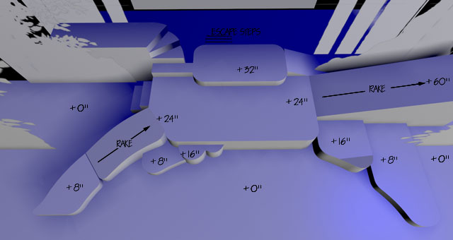
This CAD model shows the shaped platforms and ramp.
The river bank is symbolic in this show There are many other settings, including one scene inside of a diner.
The diner is played on the platforms marked in yellow. Actors can sit on the +30 platforms just like bar stools. The +42 platform is the counter.
The actors completed this illusion. Helping them helped the set. A naturalistic diner was not necessary.
Allowing the actors to sit normally as if they were in the diner supported their craft and served the telling of the story.
The “director’s playground” approach for scenery can rely heavily on the lighting design to tell the story.
It can provide a lot of settings for a show with one set, and without a lot of projections or drops.
A director’s playground works with other types of set, like drops, revolves, projections, etc.
A versatile unit set can reduce the need for running crew,
Traditional lighting can make it all work beautifully.
Music from https://filmmusic.io:
“Backbay Lounge” by Kevin MacLeod (https://incompetech.com)
Licence: CC BY (http://creativecommons.org/licenses/by/4.0/)
This video was made for Matt Kizer Design.
© 2019 Matt Kizer All rights reserved. https://scenicandlighting.com

