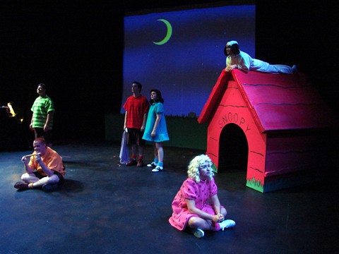
Below is documentation of the set design for this show. If you are here specifically looking for the scenic projections, the rentable media can be viewed at this link.

I copied Charles Schulz drawings obsessively when I was in first grade. My earliest experience in drawing is tied directly to his art. I lean towards being obsessive when it comes to how this universe should look. I have seen productions of this show that offended my sense of right and wrong in the Peanuts universe.
(If you are interested in the projection media, you can find that here.)
Scale is important. There is a very specific size relationship between the characters and the objects in their world. I have seen this scale violated in designs for this show. Schroeder’s piano, Snoopy’s doghouse, chairs, etc., all are very large compared to these children. Charlie Brown stands on his tiptoes to look UP into his mailbox. A realistic sized mailbox breaks this world.
Snoopy’s doghouse is pointed on top. It is not flat. Yes, he sleeps on it and sits on it. This is a problem that the design needs to solve. For this production, the peak was made from foam rubber, covered with red fabric. It was flattened just a touch to accommodate the action, but it stayed reasonably pointed. The roof used the painted board lines as places to provide footholds for Snoopy to climb up.


