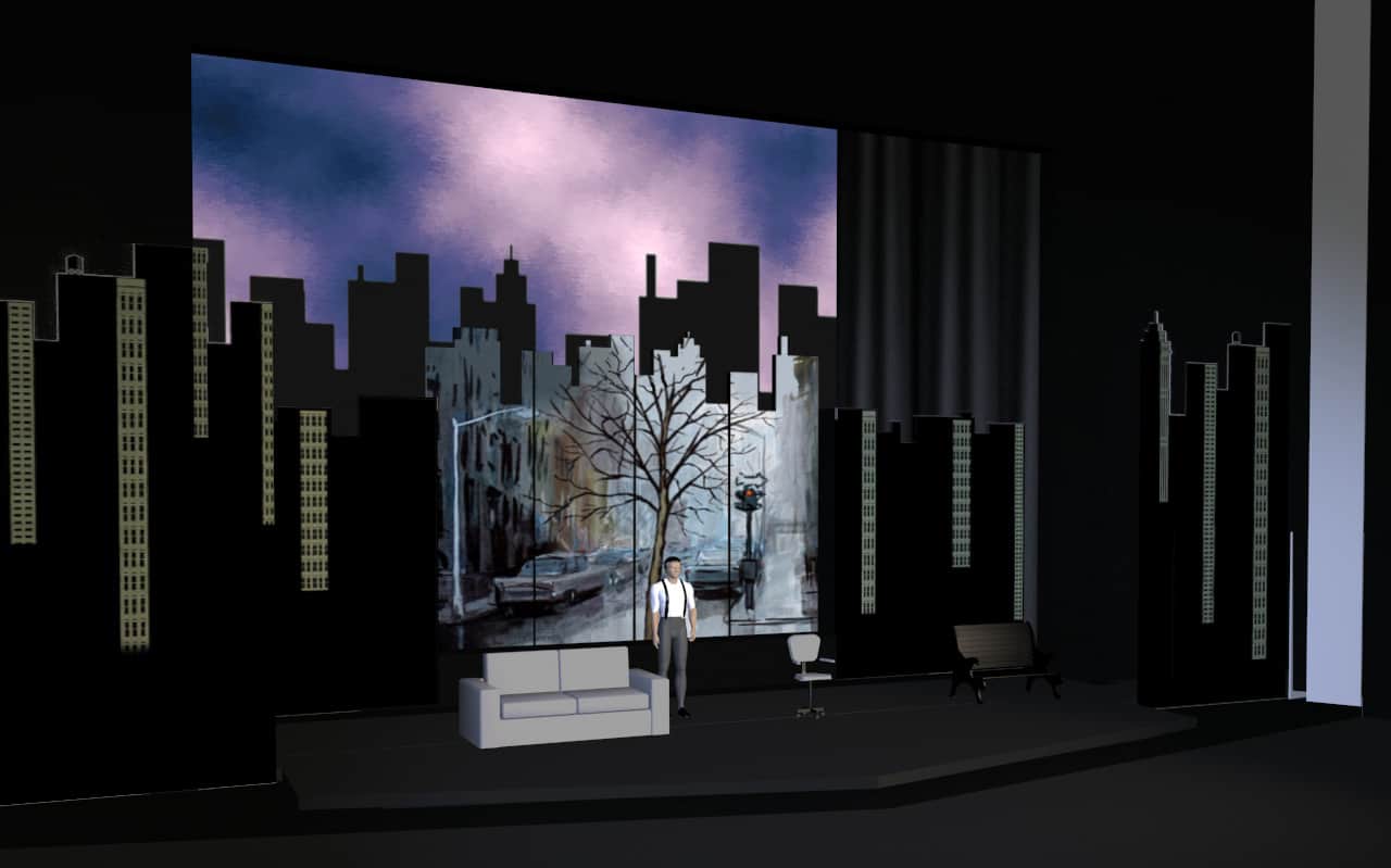
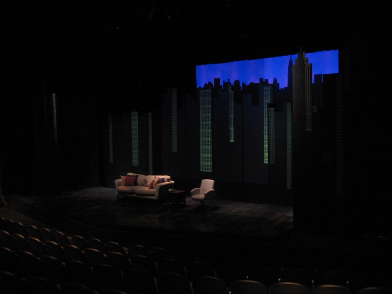
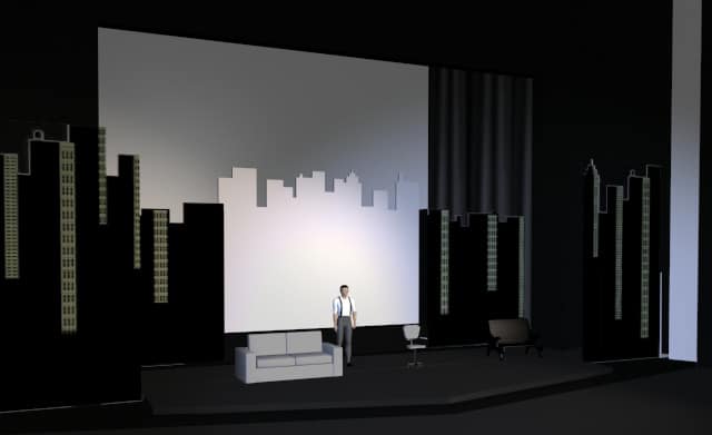
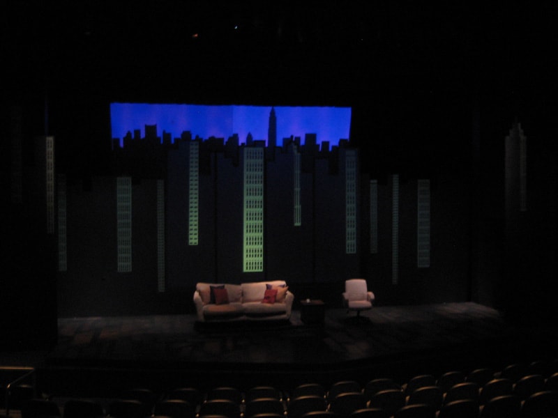
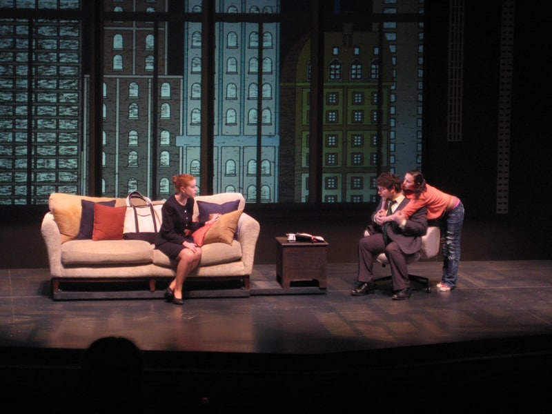
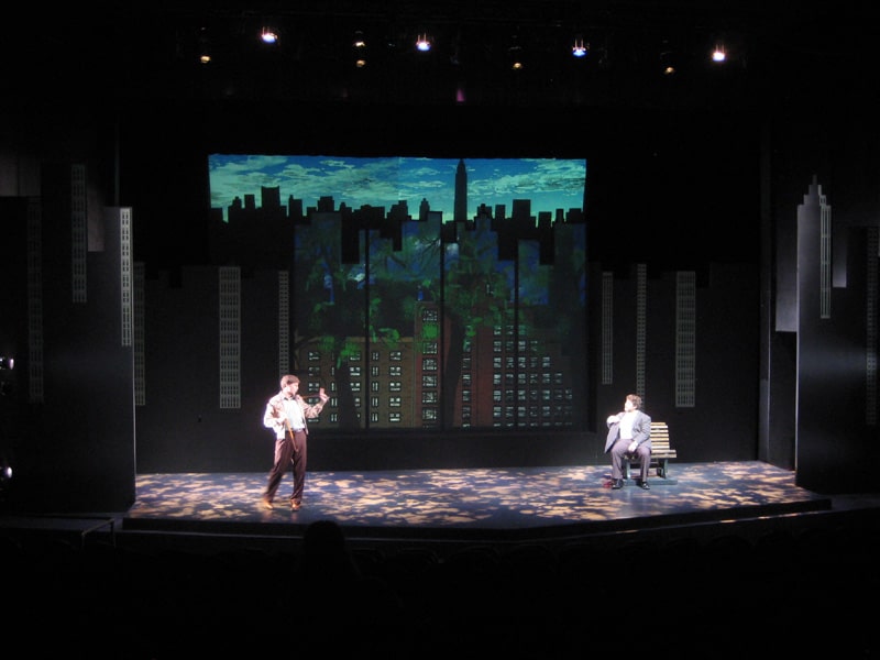
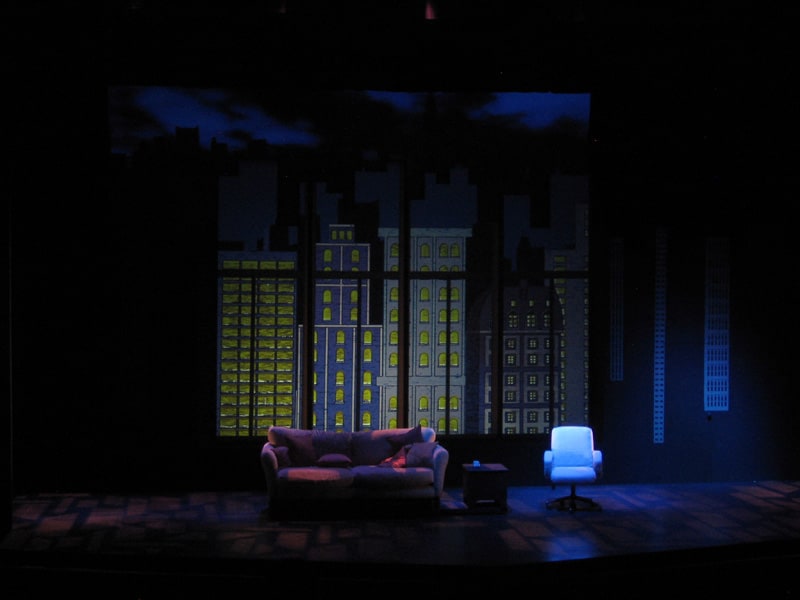
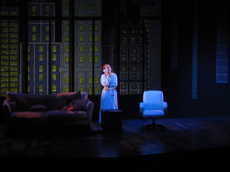
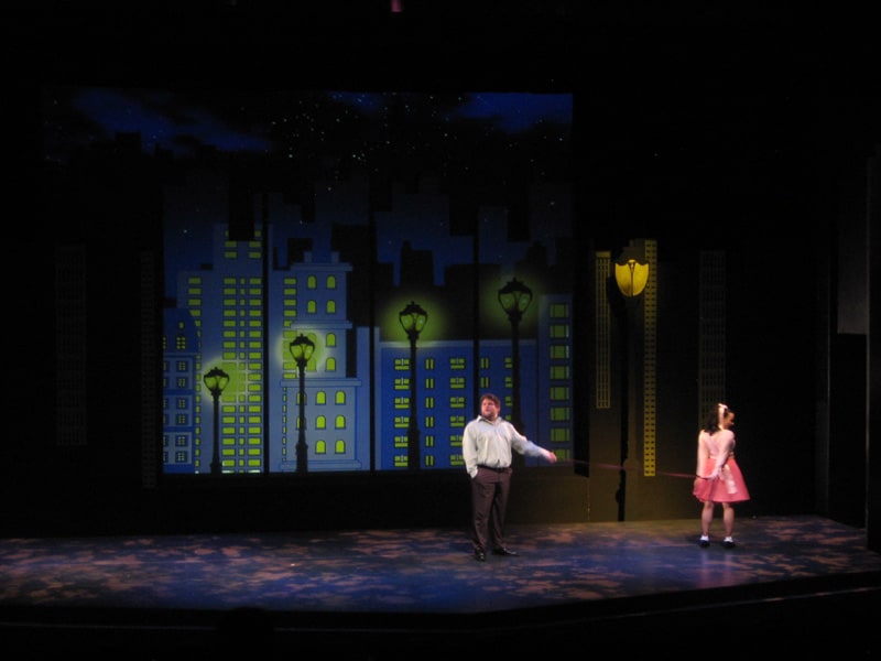
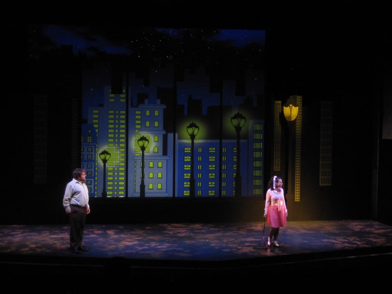
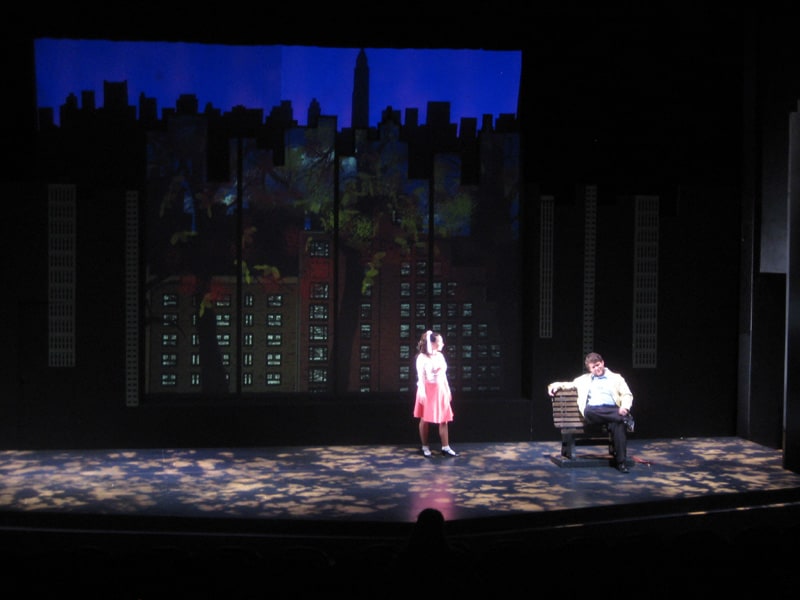
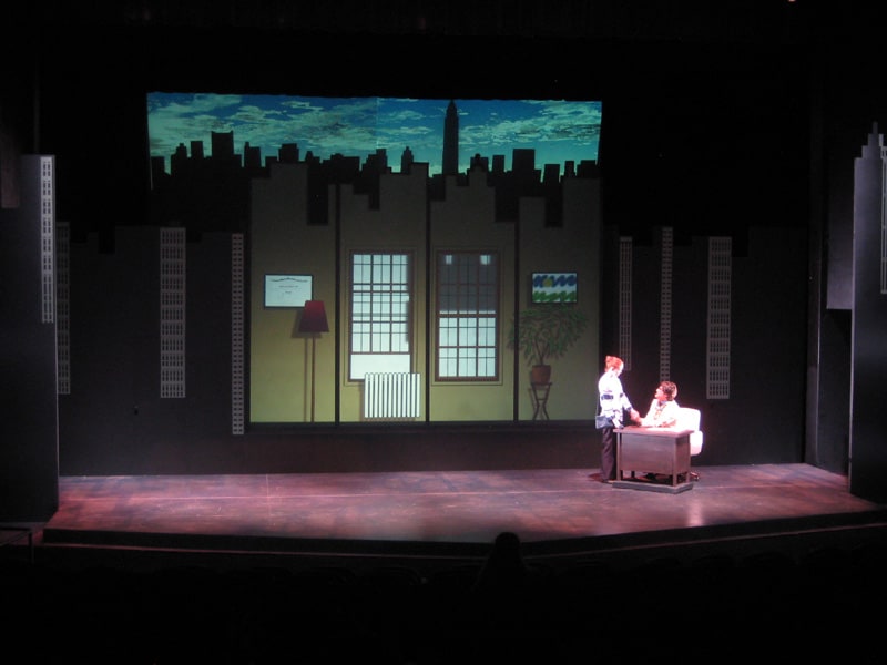
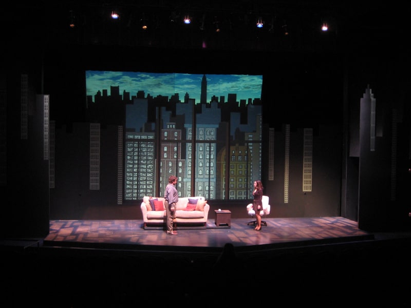
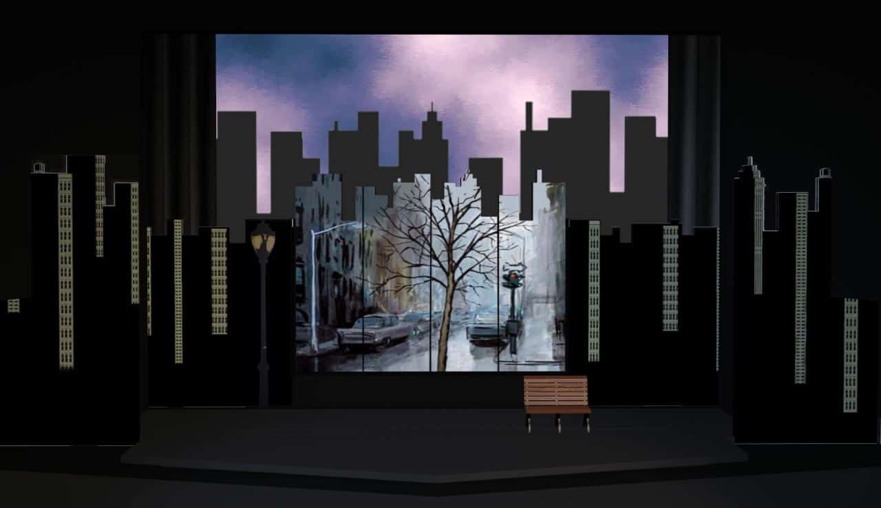
Sylvia can be readily produced very modestly, with minimal costumes and scenery. We opted to scale it up a little, instead. Settings for the show change rapidly. Time makes big leaps forward. Costumes need to change convincingly. Simultaneously, we were not pursuing cinematic realism. The show is solidly theatrical (the lead character is a dog, played by a human).
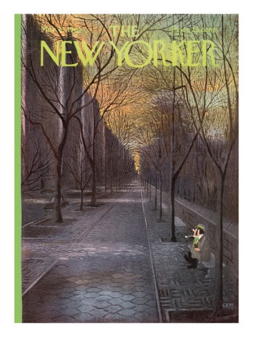
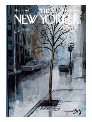
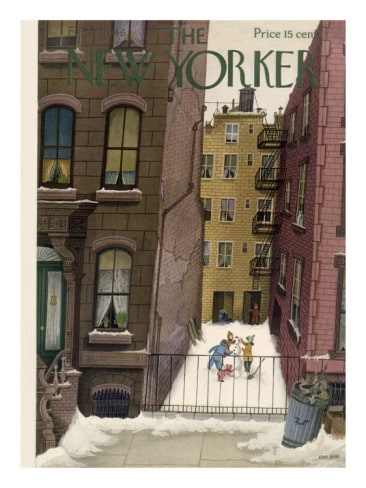
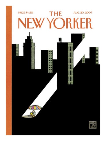
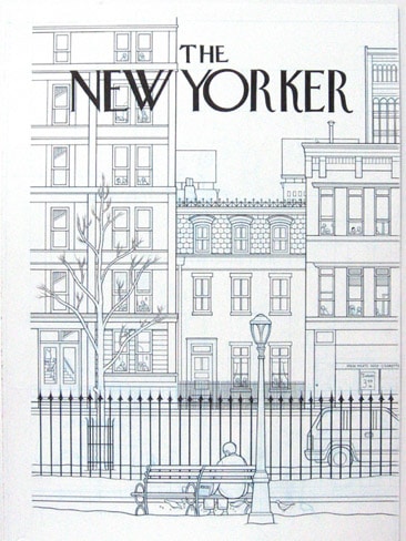
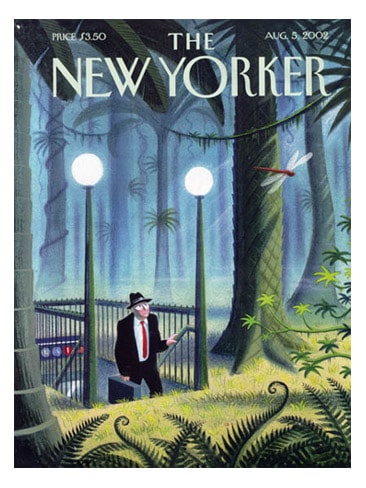
In our early design discussions, the director, Scott Phillips, returned again and again to cartoons in The New Yorker. He loved the comic simplicity and precision. We both liked that style, visually for the set. However, we also wanted to use a lot of color in the show. I suggested that we look at cover-art for The New Yorker, instead of the cartoons inside of it.
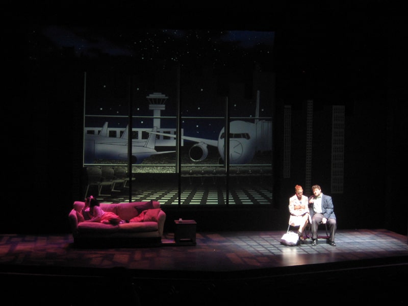
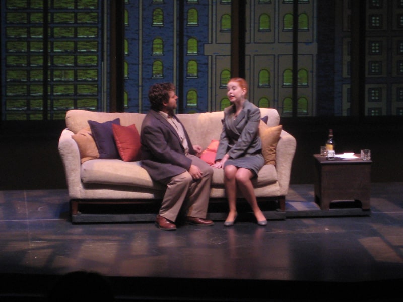
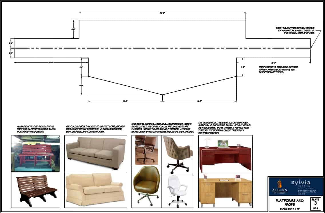
We were interested in having complete furniture changes between settings. We also needed to accomodate full costume-changes, which could potentially require a little padding between scenes.
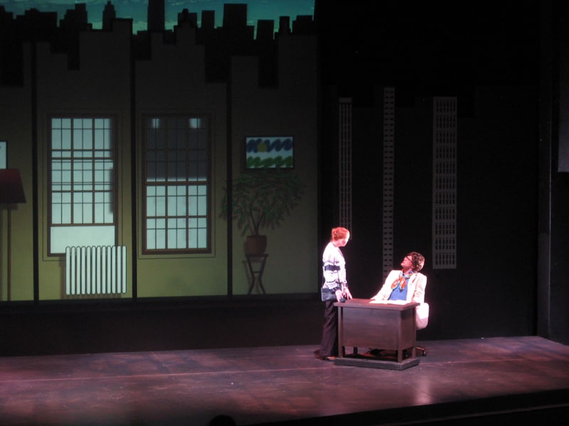
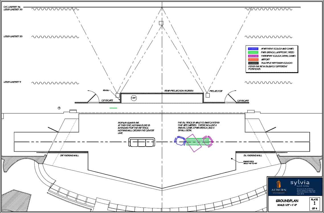
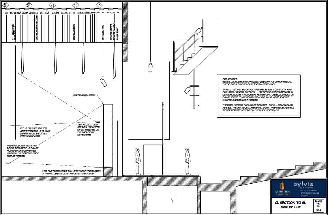
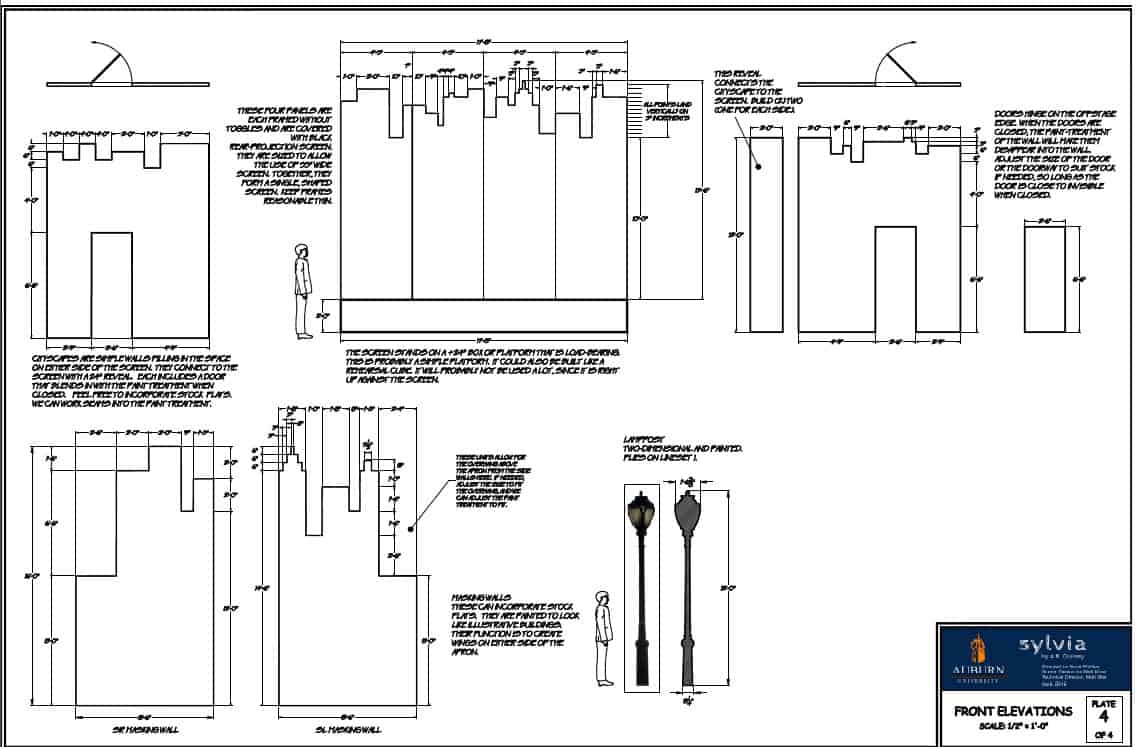
The solution in this design was to have the set transform elaborately, automatically, with music. The set changes themselves were an entertaining part of the show. Tracks in the floor carried furniture on and off stage. A two-plane projection screen set behaved like an elaborate painted drop that rendered and un-rendered itself scene by scene. The media was crafted so that we watched it quickly get painted, stroke-by-stroke.
Every drop was inspired directly by specific covers of The New Yorker.
