
TRANSCRIPT:
Anyone with any connection to the arts right now experiences a lot of pushback against AI generated imagery. There are a LOT of things to discuss in regard to AI. If you clicked on this video, most likely you already have a lot of thoughts about it in regard to ethics, society, culture, and a lot of other important things like that.
Yesterday I generated an AI image on whim. I didn’t need it for anything. I had just seen a video that mentioned how a lot of AI is creepy and weird. I asked Adobe Photoshop to use AI to generate the interior of a restaurant. This is what it came up with.
I’m putting aside everything I might have to say about those big words I mentioned earlier. Instead of any of that, I want to talk about the technique involved here. I’m going to critique this work as if it were produced by one of my design students.
First, let’s give it an initial reaction. For that, I’m going to zoom way out. Well, it certainly does look like a restaurant.
My perception of AI here is that it produces casual sketches, and then relies on some tricks to quickly make the sketches look polished.
When I first examined this image, my thoughts went immediately some advice that I often give out when mentoring scene painters. It is crucial when you begin painting that you know what it is that you are mimicking. Even if you are painting with an illustrative style, you still need to know at any given moment exactly what it is that you are painting.
For example, if you decide to paint a floor with a blue and white texture, you will end up with a floor that looks like a painted blue and white texture. It might match the costumes as intended, and it might serve the needs of the lighting designer. It doesn’t add anything to the story being told. It might even hurt the story, because the absence of intent draws attention to it. We become aware of the painter’s work because that is the only story being told by the blue and white textured floor.
Now consider if instead the painter or designer specified a specific material. We can easily stick with the same color palette. If you want the floor to be blue and white, it could be marble, or stylized stone. Even within these, I strongly advise taking aim at something specific. There are lots of different kinds of marble in the world, and all kinds of granite and other interesting stones. You can adapt the colors any way you want. Stone comes in all shapes and sizes and textures. It can be cut stone, flag stone, river stone, field stone, all sorts of stuff. Let’s say we’re going to do stone in this instance.
Even at this stage, beginning painters usually need a little guidance. Here’s a step-by-step guide I made for a production of Cinderella in 2003. I knew I was going to be far away when the painting was happening, so I took the time to create this. Cartoon stone was right on target for this design, though we still wanted an illustrative style with shading and sculpting. Now here’s where the beginners sometimes lose their way. As they get to painting the outlines of the stones, they start to abbreviate. The technique becomes all about claiming territory rather than about outlining stones. Each individual stone must receive attention, if only for a moment. Each stone needs to be given a distinct shape and outline all its own. Ultimately they need to fit together in a certain way. If you don’t give each stone it’s own shape, then you end up with what I call fish-scales.
This same type of thinking is true when doing set renderings and models. For the past thirty years, I have been working almost entirely with digital 3D models. For the sake of this video, I want to talk about drawing and sketching. Fortunately, I began doing design work even way back before then and I still have some my old hand-rendered work.
This is rendering I did for The Imaginary Invalid by Moliere. We produced this at The Ohio State University in 1994. At this time, it had been a very popular trend to transpose classical plays. Any Shakespeare other classic was almost automatically moved in space and time so that it was a black-and-white movie, or film noire, or an MTV video. The director for this show rebelled against that with this satire. This was set in a parallel universe where the French Revolution never happened. It was happening in present time, 1994, in the state of Ohio. Because the French revolution never happened, neither did the Louisiana Purchase. Ohio was still a part of the French Empire under his majesty King Louis XXIV. We called the design and architectural style Techno-Baroque. I can go on about that for a while, but I really need to talk about this rendering right now.
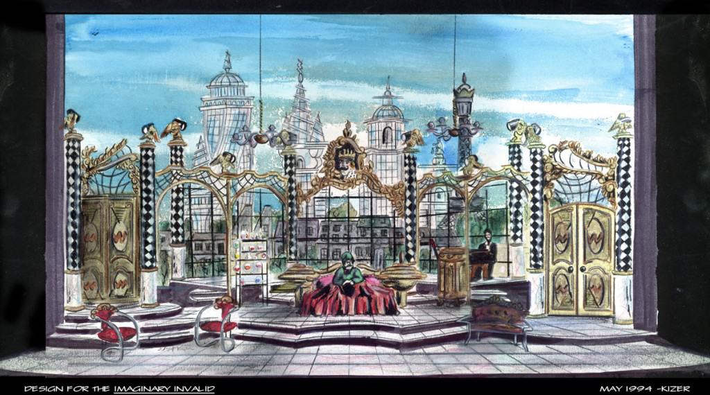
If you zoom in, you can see that everything in this rendering is a little scribbly. This was done with a combination of colored pencils, acetone markers, and dry pastels. I adopted those as my preferred tools because I could make pictures with them really quickly.
The placement of the objects in this set rendering were done with mechanical perspective drawing methods. Once upon a time each chair and wall section was sketched in. From there, the details get added. There’s always a balancing act between how much detail to aim for vs. how much time to spend.
In this rendering, I am indicating how things will look when the set is built. It’s not as detailed as a photograph. It provides enough direction so that everyone can make decisions or ask good questions. Some things in this rendering are a little ambiguous. This cabinet up here has a lever attached. It evolved a bit in its final incarnation. These doors have futuristic variations of wainscoting that merge classical baroque with Buck-Rogers. You can see little gold cupids up here, each one posing with a lighting fixture in its arms.
The important thing here is that as you zoom in on any specific thing, you can hopefully sort out what it is that you are looking at. The platforms appear to be perhaps an inch thick or so, with flat black facings set back a little. This furniture looks a little messy but it seems to be contemporary 90s office furniture with extra gold trim added on. We can see a skyline of glass and steel skyscrapers outside with some sort of smaller tenement buildings in the foreground.
This set of shelves over here up-stage-right had glassware on it with colored liquid. It looks a bit like a chemistry set. People who know the play know that Monsieur Argon is a hypochondriac who consumes medicines of various kinds throughout the play.
Essentially, this rendering is a quick-sketch, in color, with details filled in to a limited depth. Even though it does not answer every possible question, it provides a decent understand that a director and creative team can use to move forward.

Now I am going to show you a drawing for a similar show: This one is for The Liar, by Pierre Corneille. This was a preliminary drawing for a project that was never built. It’s got no color, just gray-scale markers and black pen. You’ll notice that this is much more scribbly than the rendering for Imaginary Invalid. The tops of these arches are not clearly defined. They suggest that there are some sorts of sculptural elements up on top. This could be either a finial or a small statue. These balustrades have posts that are not clearly defined. However, we can tell what’s going on here. There are free-standing columns joined by arches. Some of them support a balcony and a set of open stairs. At a glance, we can assume that this set would require welding and steel work in order to be safe to climb. Both the director and the lighting designer can formulate clear questions and begin making choices.
This method of over-simplifying something while still communicating is sometimes called abbreviation. The flagstones on the deck here are an excellent example of abbreviation. If this set were actually built, it is likely that the outlines of these flagstones would fill the set at least all the way up to these curved steps. It is important to note that even these abbreviated lines follow the rules of topography and perspective. If they were distorted in any way, we would see that as evidence that the floor is curved or sloped or in some other way unusual.
In art, we’re used to seeing details being abbreviated. There are standards and norms for how abbreviation is done. These norms vary a bit among different media and different styles, but in essence these shortcuts are a part of a visual language that we all understand.
As an artist or designer, even when you are abbreviating, it is crucial that you know what it is you are abbreviating. This sketch includes a cutout background of renaissance buildings and canals. You can see windows with shutters on this building. The windows are represented using minimal effort, but the strokes used are placed a manner that is consistent with what is being represented.
Now let’s go back to that AI generated image. I’m going to treat it as a sketch and try to unpack what is going on here.
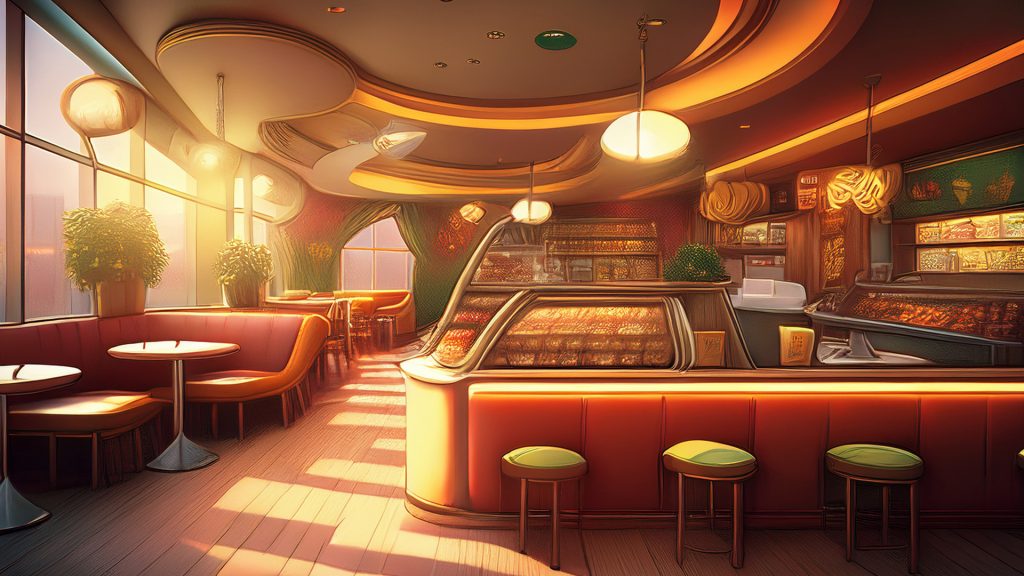
First of all, at a glance, it certainly does look like a restaurant. At least for a moment. There’s a big difference between what this AI did here and what a design generates. That difference is intention.
In a proper set design, very element represented in the rendering includes either a promise or at least a recommendation that it will be included physically on the stage. This creates a mindset in which the composition itself is actually composed of clearly defined, hypothetical physical elements.
Let’s explore this image and see how it holds up as a potential set design rendering. Let’s start in the bottom-left corner over here. There’s two tables here with a booth seat. The booth wraps around this table here. The seat gets a little messy right here, but I think I understand it. The back is oddly reclined. It doesn’t look very comfortable. There’s some extra structure of some kind visible among the legs here. It looks like there might be curtains or something hanging here for some reason. I’m not sure if or how this bench seat interacts with the other table here.
Let’s pan up. These planters are interesting. First of all, this is a terrible place to put a big plant. Someone will be sitting here, and they don’t need their head surrounded by leaves and branches. There’s not room for a plan on this ledge anyway, though this looks more like a flat piece of wood with a plant somehow sticking out of the top of it. Immediate questions from a director would be “is this plant going to be in the way of actors?” “Why is the planter flat like this?” “Could we do something else with it, like moving it upstage, or making it a hanging plant?” Oddly, the other planter shown here does not match this one. This makes it hard to understand what the intention is here.
Now let’s pan up even higher. I’m not sure what the relationship is between the window and frames are here, but that might not be a big worry. I am much more interested in knowing what is going on all along this cornice area. There abstract shapes that are glowing. This one in particular is concering. It looks like something either out of the original War of the Worlds film in 1953 or maybe from the Jetsons. There’s nothing wrong with that style, but why is it growing organically out of the window frame? Is it a light? Is it a part of the window itself? Look at this next glowing blob upstage. It doesn’t even have any detail. It’s surrounded by some sort of fog. The next light has very little detail too, though it shaped more like a 1950s television screen for some reason. Some sort of structure is indicated beneath these, but that structure just ends right here at the War of the Worlds.
Let’s take a look at this ceiling. It’s got an interesting layered, level effect happening that’s appealing. There seems to be some sort of narrow column or support right here – or you might begin to think so. It just vanishes into the fog light.***
Moving on across the ceiling, we get to these recessed lights up here. Most of them do look like recessed ceiling lights. I’m not sure why they are scattered around randomly. I’m definitely not sure why this one is big and green.
Panning down and to the left we arrive at whatever THIS is. Is this sculpture? It is certainly confusing. It might be a giant sculpted Planaria worm. If I treated this as a set rendering, I would ask for more drawings and perhaps some supporting research to provide clarity.
Let’s look at this wall way back here in the back. At a glance you might have thought it had drapes. Buuuut no. Instead, the wall itself is SHAPED like drapes, framing the window. The truth is that I kind of like this effect – except that this is an absolutely bizarre choice for the interior of a diner. The wall itself seems to be painted with some sort of pointalistic fauvism. I must ask, “What is the intention here?” Should there be drapes? Why is the style of the wall here so very different than the style towards the front? Somehow we have transitioned from Nighthawks to War of the Worlds to either Renee Magritte or Henri Rousseau and we haven’t got even a third of the way across the image.
Let’s have a look at this floor now. It’s wooden planks. Okay. The light from the windows is hitting it. The light on the floor has nothing to do with the windows shown in the image, but we’ll call that abbreviation and let it go.
Let’s move over to these stools. Why are they here? There’s no counter to sit at here. Why is this wall padded? It looks like the back of a diner booth, but it’s got no seat. What is the intention? These stools each have only two or three legs. They don’t all reach the floor. I’d write this off as abbreviation if these were not in the absolute foreground of the image. These are not background elements.
Speaking of other things in the foreground, let’s look at this display case. In a diner we all know what sorts of things we might see in a case like this. Inviting desserts. Pieces of chocolate or lemon pie. If this is a deli, we might see bins filled with chicken salad or sliced meat.
This particular display case appears to be packed to maximum capacity with something brown and textured, pressing right up to the glass. What do you think? Meatloaf perhaps? It’s got veins whatever it is. Try not to think about it.
Over here next to it we have a little ornament of some kind with a leafy branch carved into it. I suppose that goes along somewhat with the Rousseau painting on the back wall.
Now let’s look above the counter if we can. I am looking at this structural element right here. It APPEARS to be another display case frame, except that it goes on up and touches what can only be another hanging War of the Worlds ceiling light. Let’s call that mistake and move on. The display case all the way at the back wall is divided into shelves and cubbies. Each is filled with the same vague textures. Cranberries? Walnuts? Avocado pits? Eyeballs? You decide!
There are very similar display cases over here on the right. The AI made a very poor choice for these cases. It did not choose anything at all to put inside them. It simply filled them with a generic red and brown texture. The lesson here is that it is really easy for things to be super weird and super creepy if you do not make choices.
Finally let’s pan up and look at this area up here. First we see more odd abstract mosaic wall paintings. Then we go left to where two bundles appear to be hanging from the ceiling. I think the one on the left might be a sleeping bag, or maybe a rolled up tent. I’m not sure why it is stored there. The one on the right, as far as I an tell, is either a large wad of pasta, or is possibly The Brain From Planet Arous.
So in review, what AI has done here is across the board the exact opposite of what a good designer will do. Not one item in this rendering has been place here with any understanding of what it is, why it is there, or what it contributes. Not one area in this restaurant has any intention for movement or actors or any kind of existence. The display counters have no purpose and no contents – they display nothing. Our human eyes search images and spaces for understanding. We identify the shape, volume, and assembly of objects by tracing their outlines. In this image, outlines and form and style are abandoned in the name of filling the canvas. And that’s what AI is really good at: creating lots of content, just so long as you don’t care what the content is.